Energy Use Analysis
- Matt Zaske
- April 20, 2020
- 7 minutes
A little over a decade ago we had a ground-source heat pump installed for our home heating and cooling. Commonly called a 'geothermal' system, the basic function is that it uses the earth's relative/stable temperature (well below the frost line) to act as a heatsink for air conditioning and heating. In the winter (or heating season), heat is transferred from the ground and (through the process of compression) 'superheated' where it's released across a typical air conditioning coil in our normal furnace. In the winter (or cooling season) this process is reversed, and heat is transferred from the air conditioning coil and released underground. There's much interesting about how our system operates and the physics behind the process, but that's not the subject for today.
When this system was installed, I decided to deliberately start collecting electric energy use data in a way that would allow me to "compare" our heating and cooling costs before and after the upgrade. This was not much of an actual exercise, though, because I'd kept all of the various power and fuel bills going back to when we bought the house. It was merely an act of data entry and management. And so I went back four years prior to installation (ca. 2006), just due to ease of document availability, and built out a little spreadsheet with the basics:
| Month | Pri Meter | Sec Meter | Access Charge | Other Charges | Tax | Round Up | Total |
|---|---|---|---|---|---|---|---|
| 2019-01 | 48589 | 3667 | $41.50 | $0 | $6.87 | $0.87 | $204.00 |
Of course, that's not particularly interesting or necessarily useful, so a few additional calculated columns were added that figure out more specific usage:
| Total kWh | Base kWh | Load Mgmt kWh | Base Cost | LM Cost | LM Savings | Bill Calc | Difference |
|---|---|---|---|---|---|---|---|
| 2017 | 577 | 1440 | $60.87 | $93.89 | $58.03 | $204.00 | $0.00 |
Some Assumptions and Necessary Background
Dude, You Need More Data...
First off, these examples are but one line (real data from January 2019 usage), and don't include the whole story or all the data points required to do calculations. The calculated fields require the previous row's worth of meter readings to calculate accurately. This way merely entering the meter readings month after month auto-calculate the kWh usage (and thus allow me to figure out the usage cost).
Load Management?
We have participated in load management programs offered for the entire time (well, save for the first two months after we bought the house before replacing the water heater). As such, we pay a lower rate for electricity used for heating water and operating our heating/cooling system in trade for letting the power company control when these loads are allowed. This lower rate is about 35-40% lower than the regular base residential rate. In order to calculate that difference, all of our load management kWh goes through a second subtractive meter (or secondary meter as I have it in the spreadsheet).
Another assumption is that our water heating cost is pretty stable and consistent throughout the year. Ideally we'd have a third meter for this, but we're charged for each submeter and it's not worth that.
Wait, Something's Missing...
Correct. I have three additional fields in the spreadsheet for 'constant' variables, specifically the base kWh rate, load management kWh rate, and in our case, the 'multiplier' value for our load management meter. These bits are necessary to do the rest of the math.
That's Cool, What Now?
From the calculated fields I can easily see that it cost about $94 to heat the house in January and that we "saved" (cost averted, really) about $58 by participating in load management programs. Non-load managed electricity use (everything else) cost about $61 that month. When I look at the data sheet itself, it's easy to compare month to month or year over year how our electric use has changed. That's really difficult to meaningfully show in a picture, though...
Enter...CHARTS!
Something visual makes things easier to understand...so I have created a handful of charts that can be generated from the usage data. One of my favorites is the one that includes total kWh usage, the bill amount, and an overlay line generated based on load management "savings."
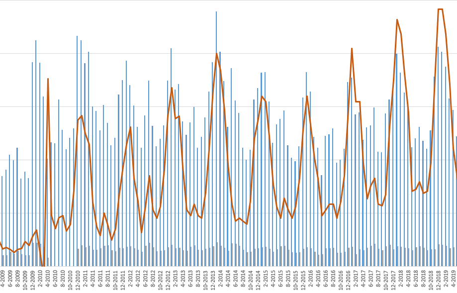
What I most like about this is I can visually correlate the savings of load management with our actual kWh usage. For months where the orange-ish line trend with the tall blue line, I can see that the spikes in usage are mostly related to load under management (and not something else weird or another anomaly). This is also heavily seasonal, because our heating load is far greater than our cooling load (and the cooling load rate is slightly less advantageous than the heating load rate).
Other Nuggets of Goodness
There are some interesting bits in this chart, though, specifically those early on (pre-December 2010). Until about March 2010 we didn't have the heat pump included in our load management system, so the majority of the 2009-10 winter was paid for at regular 'retail' rates. This was mostly due to the fact we had to have our LM meter swapped out for something different to support multiple loads and additional rewiring that was necessary (some of which needed to be done by the power company).
One additional data point in this chart is the much lower gray bars. Those represent the total bill amount for each month. I didn't include the scales in this snip because they're complicated, but these data points are not using a common scale. But hidden in this data is also an absence of bars from about April 2009 until December 2009. This is because we didn't actually have a bill due during those months due to heat pump rebates for the installed system.
Beyond that, visually I can look at the various bars and kind of understand where anomalies arise, and more importantly why. Life changes, weather, and so forth can explain some of this data. In the raw data I can also easily determine how my load management savings or cost aversion has added up. Spoiler: it's been several thousand dollars of averted cost over some fifteen-plus years. But I can see that and understand.
More Analysis!
One thing that I've not yet done is take some of this cumulative data and compare it against our older fossil-fuel (fuel oil) based heating system. I have all of that data as well (just not digitally in a spreadsheet because it's delivery based (or seasonal) and not strictly usage based. One has to look at those figures at a seasonal or yearly level to be meaningful and I've just not done it. Casually I know what the difference is (and it is substantial).
Additionally, I've not really looked back at the return on investment, namely due to the aforementioned (fossil fuel data). That would take a little more careful examination, since I'd have to estimate usage over the years and with life changes. Further, I'd have to pull some market data to obtain average fuel prices since those markets are far more volatile. But it's doable and totally on the list.
Yup, this is super nerdy and not terribly useful. But just like other components of life analysis (financial, specifically), having an understanding of where it's all going is super helpful to drive change. I didn't write about it, but another set of charts digs into regular baseload use and helped me figure out that indeed, switching everything over to LED lights made a noticeable difference. It's all in the data.
So there it is. I encourage folks to do something similar with their energy use. It does take some time to figure out, but you don't have to do what I did to better understand what your usage looks like in a meaningful way. A simple way to start would just be in looking at the total amount month-to-month and year-over-year. See where it goes from there!
Headline image via giphy
Recent Posts
Past Speaking Engagements
I was a speaker at MMSMOA, May 3-7, 2026!

I was a speaker at MMS Music City Edition, October 12-15, 2025!

I was a speaker at TCSMUG Autopilot/OSD Day, July 15, 2025!
![]()
I was a speaker at MMSMOA, May 4-8, 2025!
I was a speaker at BrainStorm K20 Wisconsin Dells, March 9-11, 2025!

I was a speaker at MMS Flamingo Edition, October 20-23, 2024!

I was a speaker at TCSMUG OSD Day, July 31, 2024!
![]()
I was a speaker at NWSCUG, July 19, 2024!
![]()
I was a speaker at MMSMOA, May 5-9, 2024!
I was a speaker at BrainStorm K20 Wisconsin Dells, March 10-12, 2024!
I was a speaker at MMS Miami Beach, October 29-November 1, 2023